Streamlined Dispatch Information
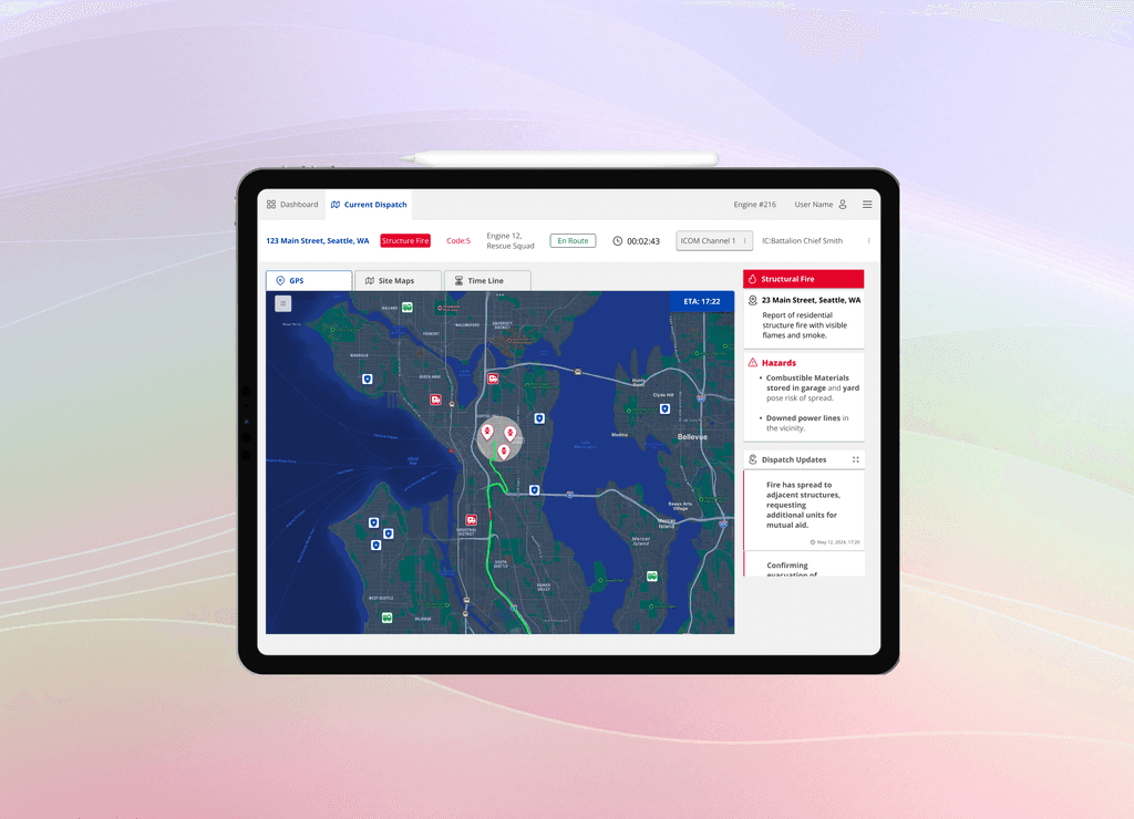
My team and I designed an interface that allows fire fighters to see the necessary information for quick responding in dispatch.
Role
UX Researcher
UX Designer
UI Designer
Team
Travis Jarrells
Sara Name
Sherry Yu
Duration
2 days
Background
Joining a Protothon
I decided to try something new and join a Protothon, meeting a team of online strangers and setting out to design for a unique situation. We selected the enterprise track, and received the prompt at the beginning of the 2 day competition.
Research
Key Challenges
My team discovered the key challenges that we would need to overcome in order to design a thoughtful interface.
Research Methodology
Separating our research as a team, we were able to cover many topics over the course of three hours. It was important to use the resources provided, but to also explore the topic as a whole to ensure our understanding of the current flow and pain points were clear.
Key Findings
Separating our research as a team, we were able to cover many topics over the course of three hours. It was important to use the resources provided, but to also explore the topic as a whole to ensure our understanding of the current flow and pain points were clear.
Hypothesis
Laying out the flow of information an action, my team was able to parse through to find where the problem was occuring. As the system was highly automated with GPS, we began to wonder what the interface was like for firefighters and what was missing to cause a delay in arrival.
My team began to suspect that there was a lack in UX of the firefighting dispatch screen. Yet, without the ability to speak with the Seattle Fire Department, we needed another way to get feedback on what was affecting arrival times.
Lo Fidlity
My Contribution
Putting ideas to paper
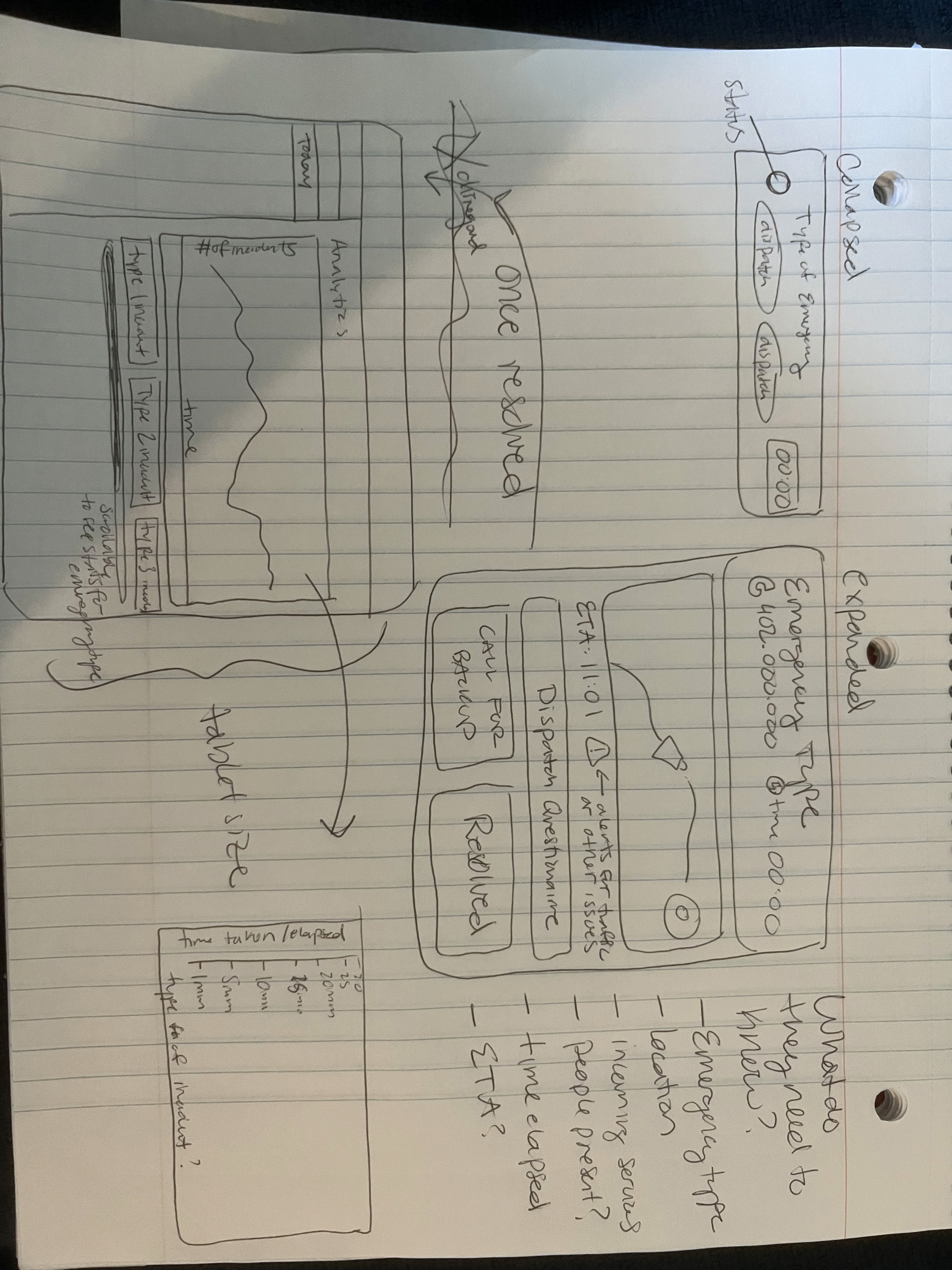
My team and I set an hour to sketch out our respective portions of the product.
I approached this by laying out what would be required to show on the main dash view, prioritizing information.
Mid Fidelity
My Contribution
Mid Fidelity
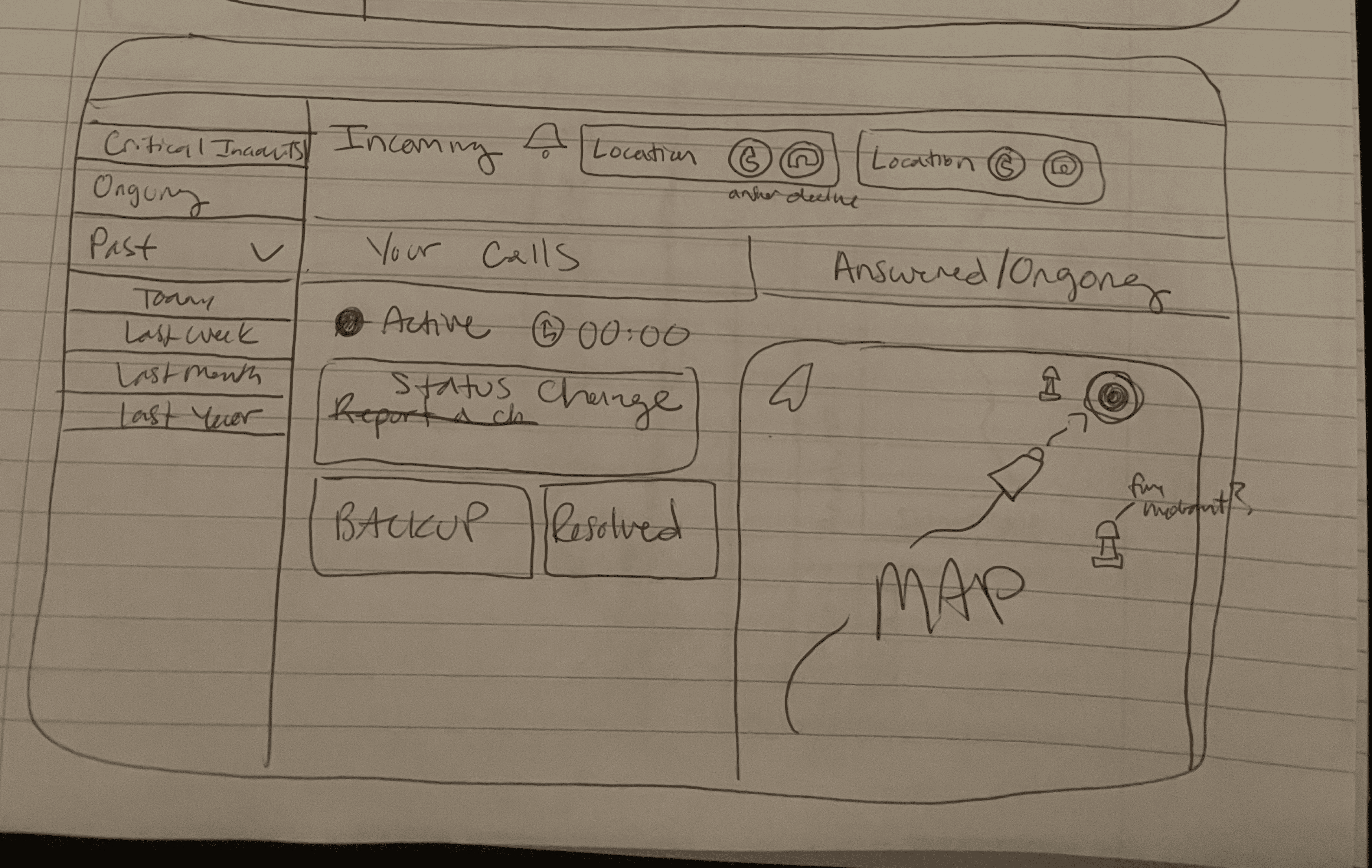
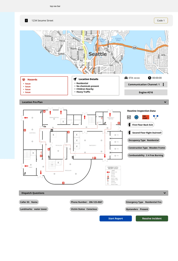
I laid out the basic requirements, prioritizing map view and the immediate hazards in the area.
I separated the different map types that we had decided to include, and included an area that could populate based on the dispatch communication.
Field Research
User Research
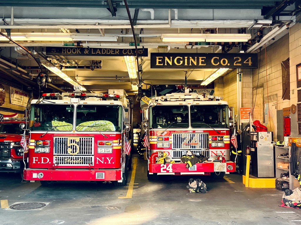
After looking at everyone's designs, I began to get antsy for true research and feedback. I live nearby a fire department and decided to see if there was anyone available to answer some questions about their dispatch screen.
Confirming our Hypothesis
Luckily there were no fires to put out, and Nick, the Captain of the station, was open to answering some questions. It turned out that our hypothesis was right, the dispatch screens for firefighters were full of pain points for their users.
Iterative Needs
Through task analysis we determined the need for:
Large interactive GPS
Access to pre-plan maps and data within one view
Hydrant location information
A clear information hierarchy that prioritizes visuals and data given at the appropriate time
Dispatch updates and alerts
Vital information about incidents front and center without extraneous information
High Fidelity
Dashboard Design Decisions
My Contribution
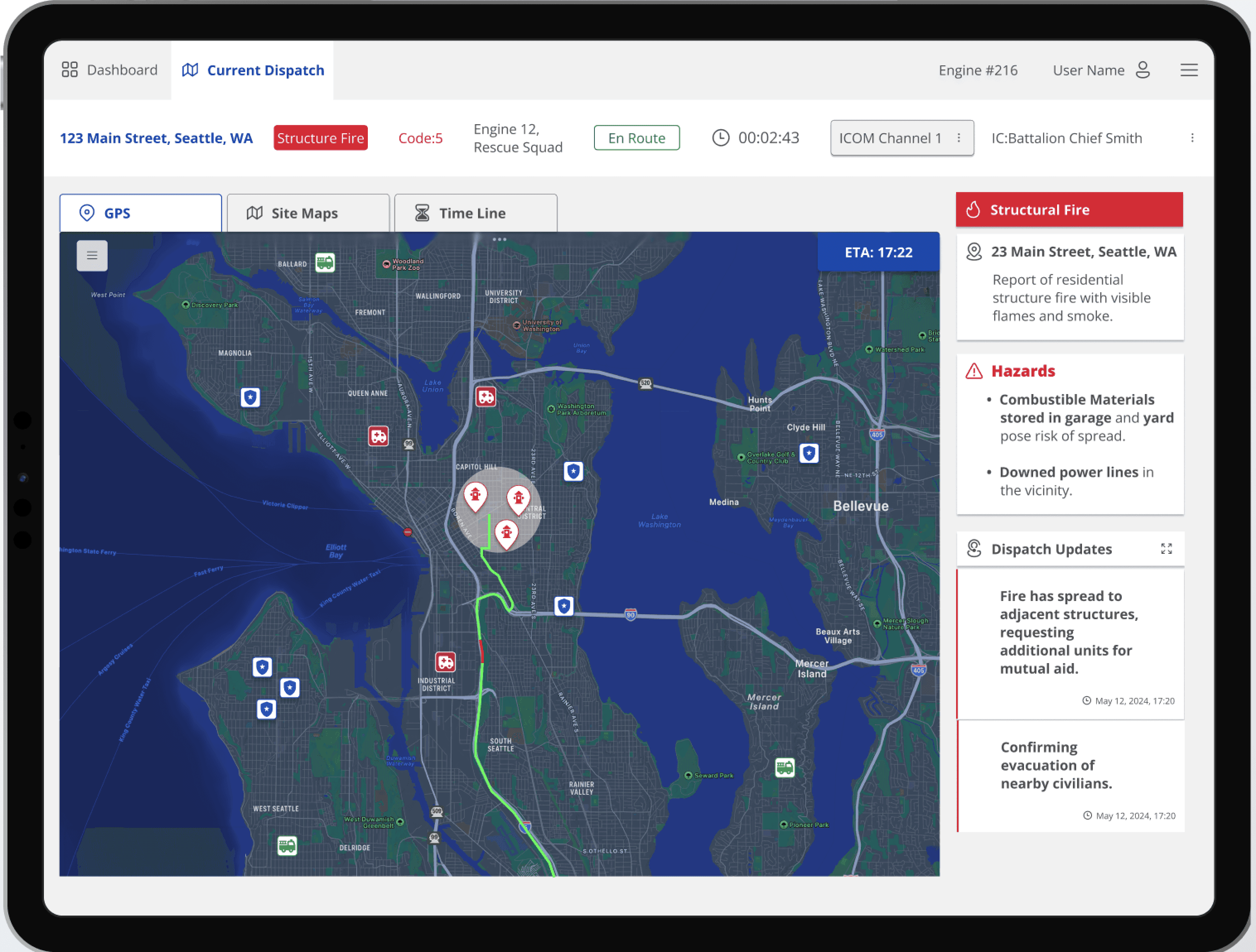
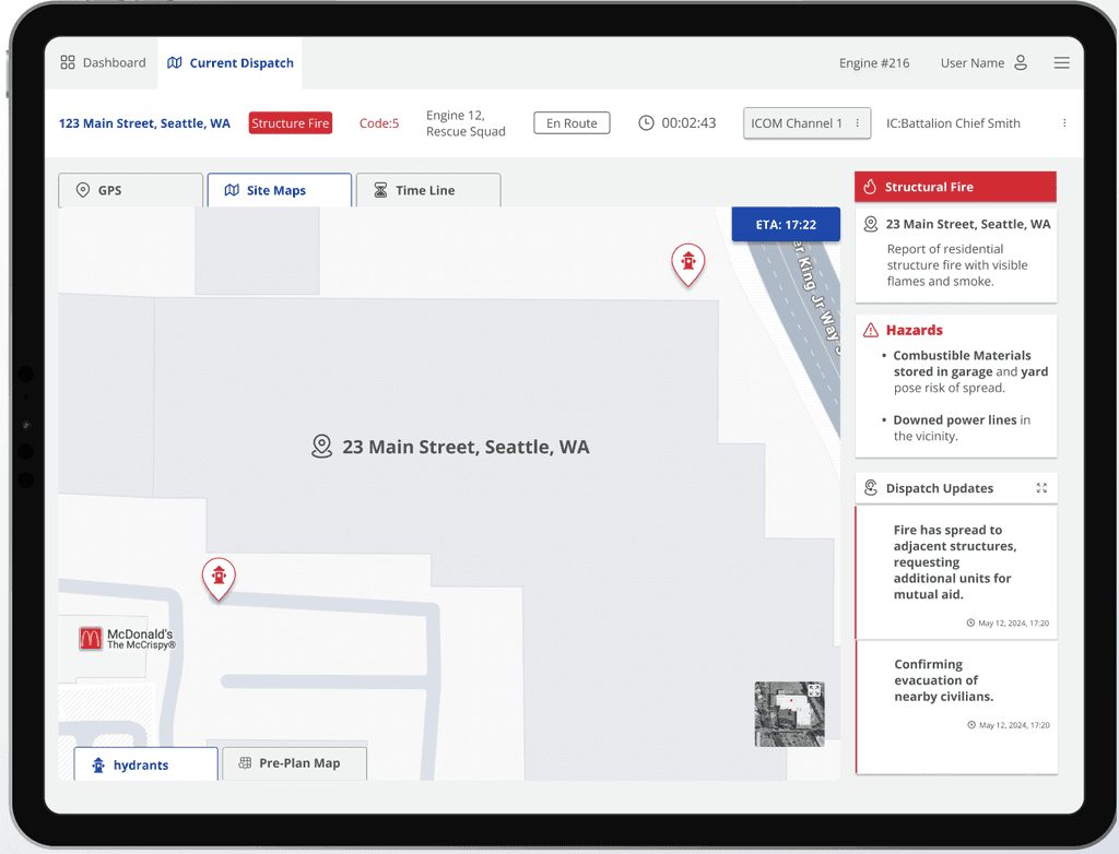
Pertinent info on dispatch is listed above map with color coded elements in line with the Seattle design system.
Details on incident are located beside map, not in a long paragraph of data.
GPS map provides directions and high level view of other first responders as well as hydrants in approximate area.
Mapping Upgrades
The map was interchangeable and included the structural maps and maps laying out the nearby fire hydrants.
A multifaceted map approach limits dispatcher scrolling and keeps their focus on the emergency.
Fast Reporting
My Contribution
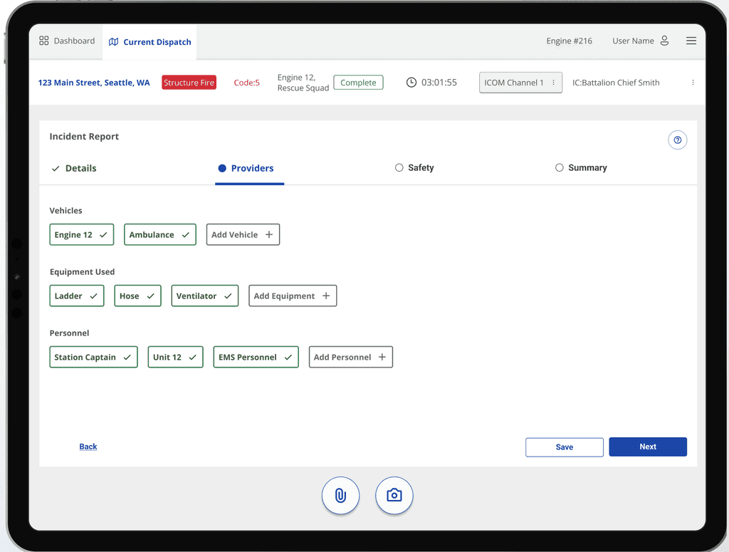
Rather than filling out repetitive and detailed paperwork, dispatch could select the pertinent fields.
Auto populating a report with the selections reduces any delays between emergencies.
Analytical Reports
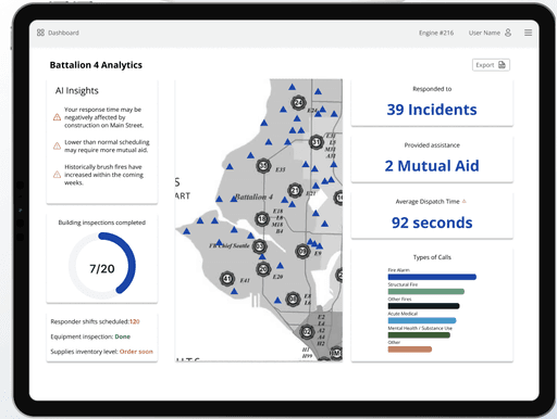
Creating a data analytics screen enabled dispatch to understand where they are able to pinpoint factors that slow them down.
Users can see relevant stats at a quick glance, or click on each section to dig deeper.
The Seattle Fire Department already utilizes AI analytics, this brings the data into the departments' viewing for accountability.
Results
Competition Results
My team did not win the protothon, but got constructive feedback that has taught me how to better communicate my design process.

